Explore unemployment rates in Philly neighborhoods using this tool
 October 13, 2016
Category: Featured, Method, Short
October 13, 2016
Category: Featured, Method, Short
National Equity Atlas has a new tool that shows users the extent of economic disparity in communities of color.
On a neighborhood level.
It’s pretty sweet. Although it’s in beta and still a little slow and janky, the map allows users to toggle through the economic welfare of White, Black, Latino, Asian, Native American and general communities of color.
The part that’s not so sweet is the patterns the maps reveal. Populations of communities of color have risen, but so have unemployment rates among them. The image below is the unemployment rate of communities of color in 2014. Blue is where unemployment is the highest.
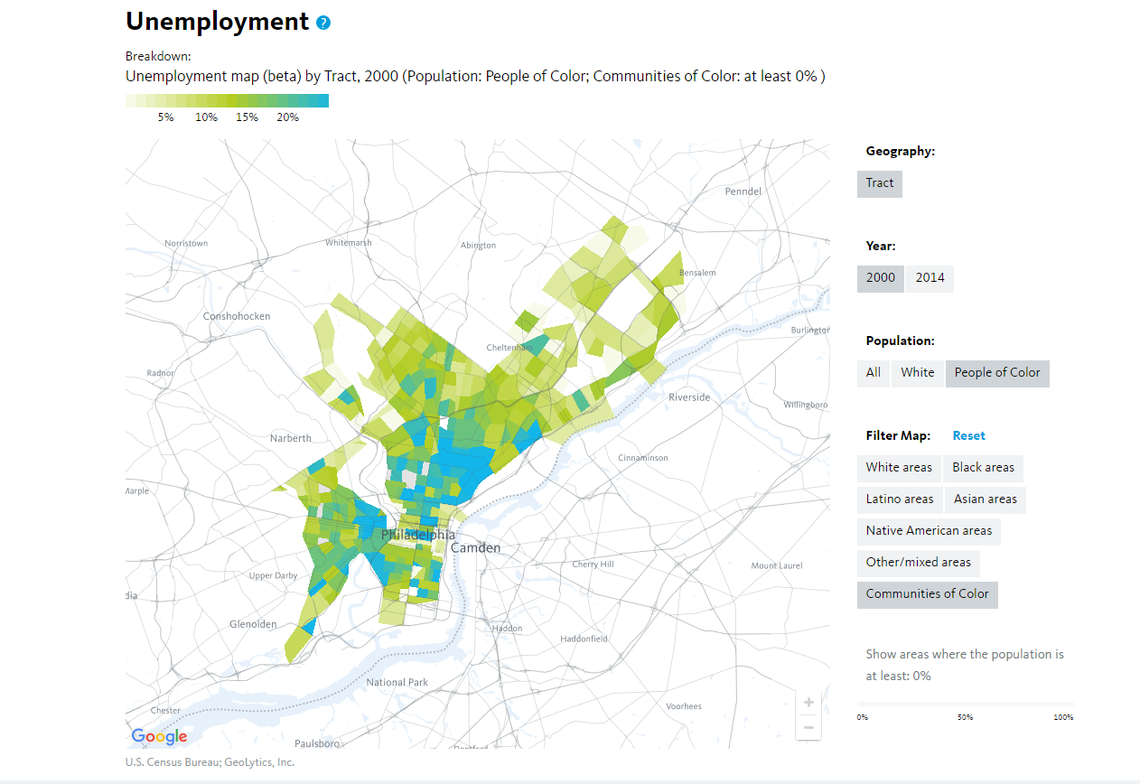
Unemployment in communities of color in 2000.
Here’s how it looked in 2014. Note the unemployment increases in North, West and Southwest Philly.
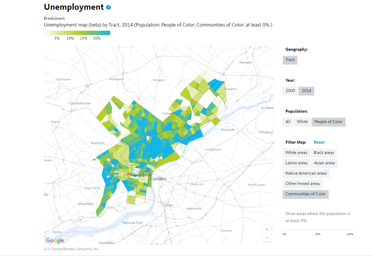
Unemployment in communities of color in 2014.
That’s just scratching the surface of what the tool can do. It can also be used to explore school poverty, wage rates, populations of working poor, car access, gender, age, immigrant contribution to economic growth — it’s robust.
But again, it’s in beta.
National Equity Atlas also outlines some factors to unemployment rates in communities of color.
“Racial differences in employment result from differences in education, training, and experience as well as barriers to employment for workers of color such as English language ability, immigration status, criminal records, lack of transportation access, and racial discrimination and bias among employers and institutions,” the site reads. “Policy and systems changes that remove these barriers and increase education and job training opportunities will lead to greater labor force participation and a stronger economy.”
Want to really test yourself? Zoom into Philadelphia, select “Black” or “Latino” populations, then toggle the scroller at the bottom of the page up beyond 50 percent. Go ahead — give it a shot.
Check it outTrending News


Unlocking Greater Philadelphia's Workforce Potential: Challenges and Opportunities Ahead
Read More >
6 things we know about you
Read More >