These digital tools make data storytelling easy for nonprofits
 June 15, 2018
Category: Event, Featured, Medium, Method
June 15, 2018
Category: Event, Featured, Medium, Method
Disclosures
This is a guest post by Code for Philly Co-Director Toni McIntyre.Sometimes, all you need to get started on a challenging project is a helping hand to nudge you forward.
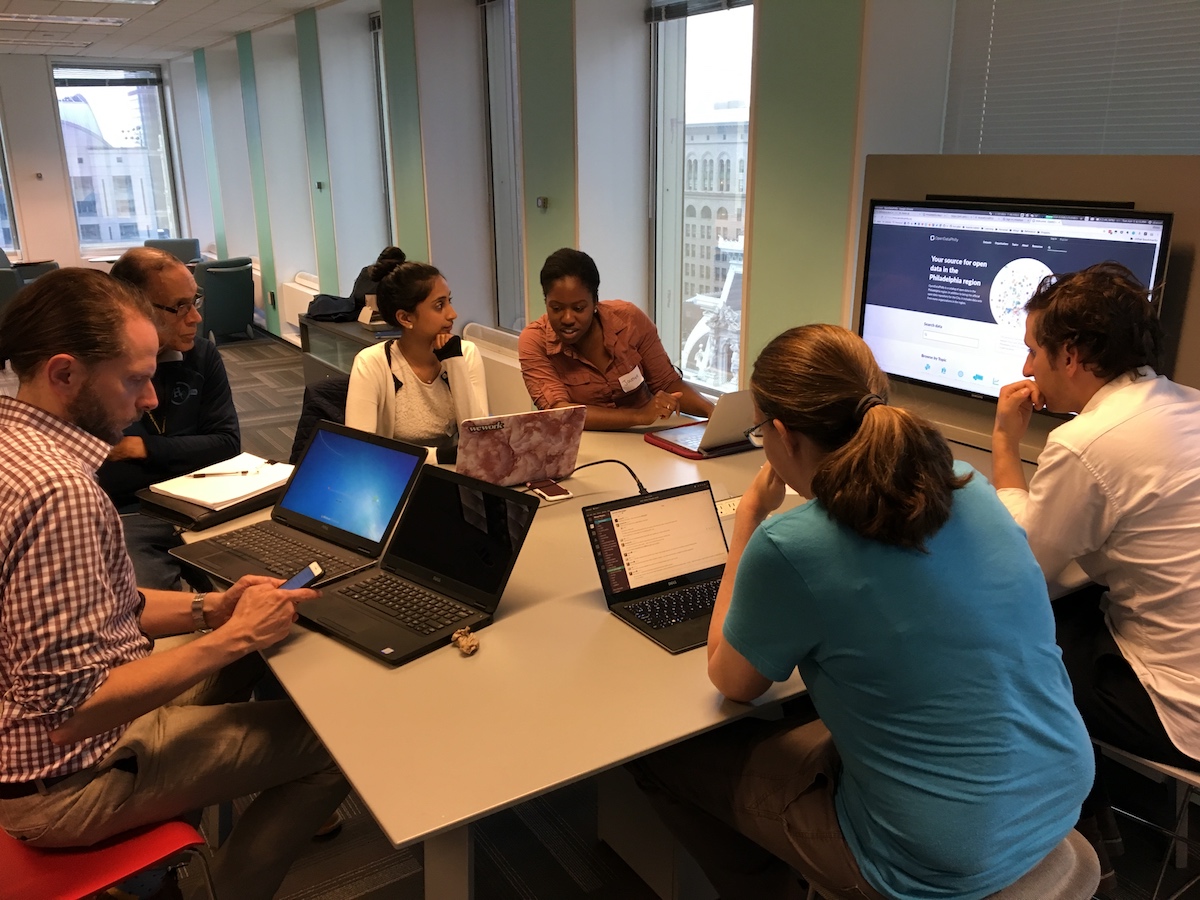
Last week, Generocity wrapped up the second installment of its Tech in the Commons bootcamp series for local nonprofit leaders with a project night held in the City of Philadelphia’s Innovation Lab. Two of this year’s Tech in the Commons session, presented by the Knight Foundation and Comcast NBCUniversal, were focused on digital and data storytelling.
Code for Philly leapt at the opportunity to lend a hand with project night. We know our community has experienced professionals who are looking for smaller, less time-intensive ways of making a civic-minded impact. Serving as mentors for Tech in the Commons project night was a perfect way for our volunteers to do just that. All they needed was to come to the project night with their existing experience and a willingness to coach nonprofit leaders.

(Photo by Julie Zeglen)
Attendees of project night were encouraged to bring data sets, specific projects or questions with them so they could best take advantage of their time with our mentors. When fewer people than we anticipated arrived with their own data sets or data-based projects, we quickly broke into groups based on attendee familiarity with data.
By the time we closed up shop at the Innovation Lab, everyone left with either a new milestone in mind, additional resources to explore, or a new understanding of data and data storytelling.
We want to thank our mentors, who graciously gave their time and expertise:
- Kathryn Killebrew, developer with Azavea (and 2016 Geek of the Year)
- Simon Kassel, data analyst with Azavea
- Marieke Jackson, data scientist with Health Union
- Meghan Kelly, UX researcher and graphic designer
- Mark Wheeler, interim CIO for the City of Philadelphia
- Alexander Rivera, senior consultant, data analytics with Comcast
(Photo by Julie Zeglen)
They also helped gather some final tips for all our nonprofit attendees, and anyone else who may be interested in data and storytelling:
- There’s nothing wrong with Excel! It’s an oldie but a goodie when it comes to storing and managing data. You can also use Google Sheets, which also has the ability to create simple charts for you and has the added bonus of being free.
- Speaking of free, you can make simple visualizations without spending big bucks. Tableau Public is a good free option, with a more powerful version available at a special discount rate to small nonprofits. DataHero is another good free option that lets you create charts and graphs in drag-and-drop fashion.
- If affordable mapping of your data is more your speed, there’s Carto and Mapbox which offer their services free of charge to “a good cause.” There’s also OpenStreetMap and OpenHeatMap. Remember: Anything with “open” in their name is, in general, going to be about the free exchange of data and information — see “open data” and “open source.”
- Remember: “Garbage in, garbage out.” Any visualization you make is only as good as the data you collected. Bad data results in bad visualizations.
- Less is more! Just because you have a certain amount of data at your disposal doesn’t mean you have to use it all.
- Avoid jargon when you’re crafting the story around your data. It can be easy to fall back on industry terms that your readers may not know or be familiar with. Get a friend to do a second read-through to keep you in check.
- Always ask, “Why this story?” If it doesn’t provide context to your data and bring it to life in a way that can be meaningful for the reader, than it may not be the right story.
- There are several affordable or free options for making infographics to embed on a web page or in a blog post. Infogr.am is a web based tool that lets you upload a data file and generate an infographic from there. Easel.ly is another good one and as close as you can get to expensive-looking infographics without actually hiring a designer (though if you can hire a designer, you should hire a designer). Canva is a great option if you want to tweak your data so it’s optimized for social media (the right height, width, appropriately eye-catching). Need free stock photography for your presentation or blog with your data and story? We recommend Unsplash.
Project
Tech in the CommonsTrending News


A Generocity update, and our 2023 editorial calendar
Read More >
We’re innovative changemakers. Why shouldn’t we fundraise the same way?
Read More >